TECT
BRAND ROLLOUT / WEBSITE / DIGITAL
BACKGROUND
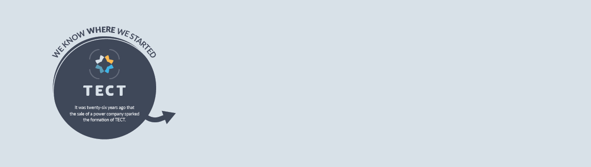
As a community-focused trust, TECT provide support for local initiatives, facilities and events that bring vibrancy, connectedness, growth and economic benefits to the region. Their transformational funding process brings life to grassroots organisations and large-scale multi-million-dollar projects alike. Since their establishment in 1993, they've been at the heart of our community making a difference with their distributions. They provide funding and rebates in the Western Bay of Plenty and Tauranga regions.


THE BRIEF
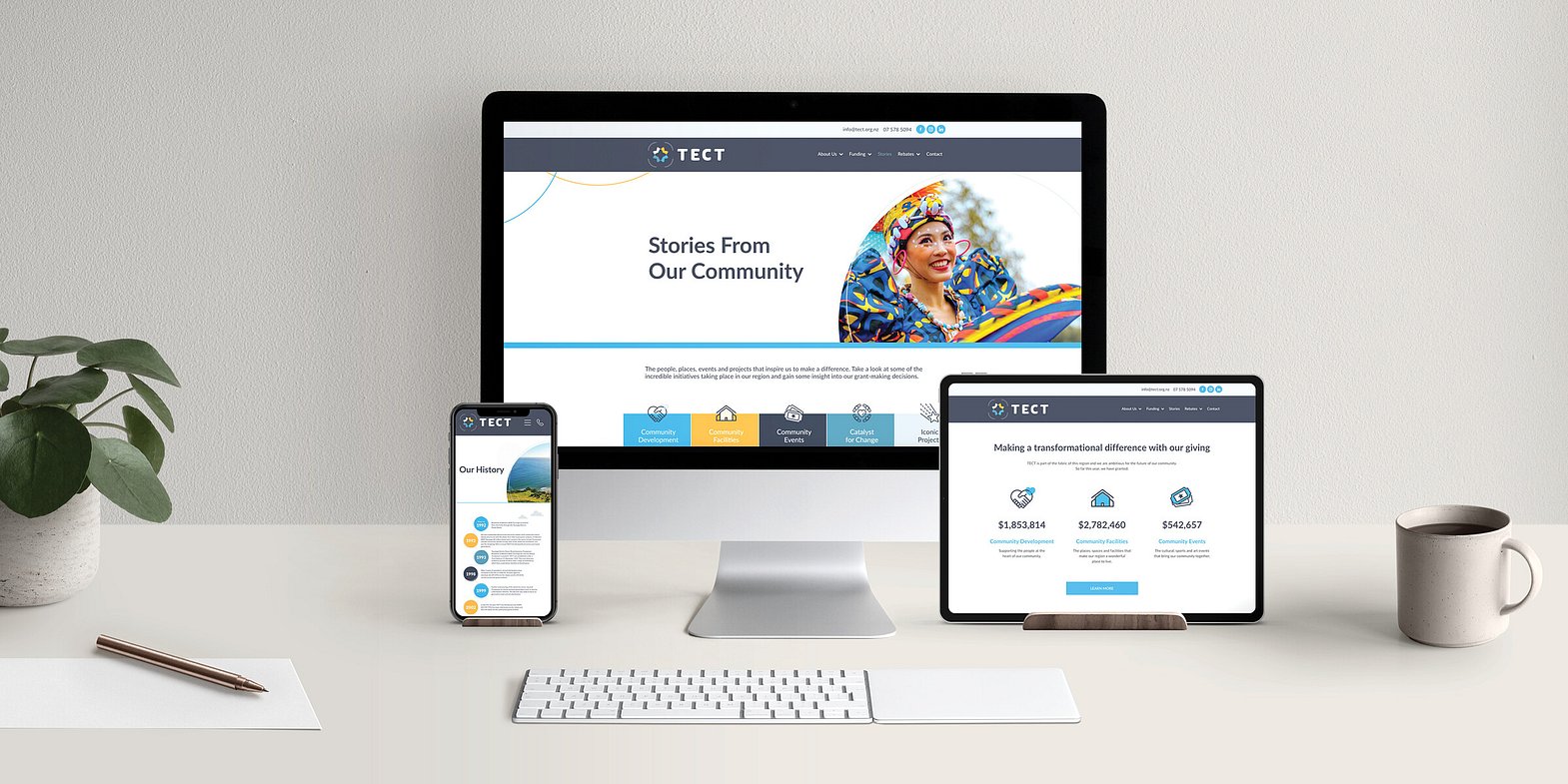
Metro Marketing was engaged to develop and rollout brand imagery and material in support of the new TECT logo. The new brand direction was to celebrate our vibrant community and depict its connectedness. Inspiration for the brand came from the TECT tagline 'at the heart of our community'.
IMPLEMENTATION
The chosen brand featured overlapping circles and a circle pattern to represent community connectedness. The colour palette came from the logo, with it inspiring prominent blue and yellow tones in the chosen local themed photography. With the new brand established, we then rolled this out across various stationery, digital media, website, signage and in the organisation's Annual Report.

Do you have an upcoming project or are you looking for a marketing and design partner? We'd love to grab a coffee and discuss things further.
Every great brand begins with an even better story...

